Visual identity of the youth organization Young Folks
Brief description of the project
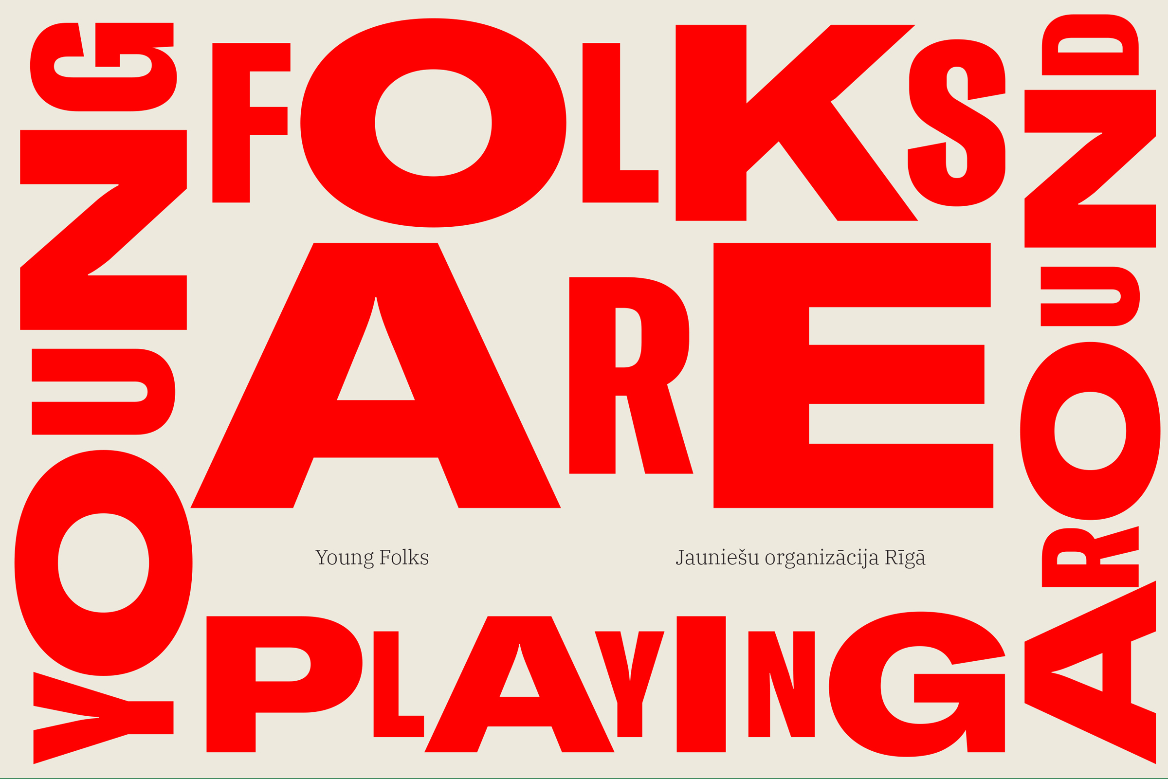
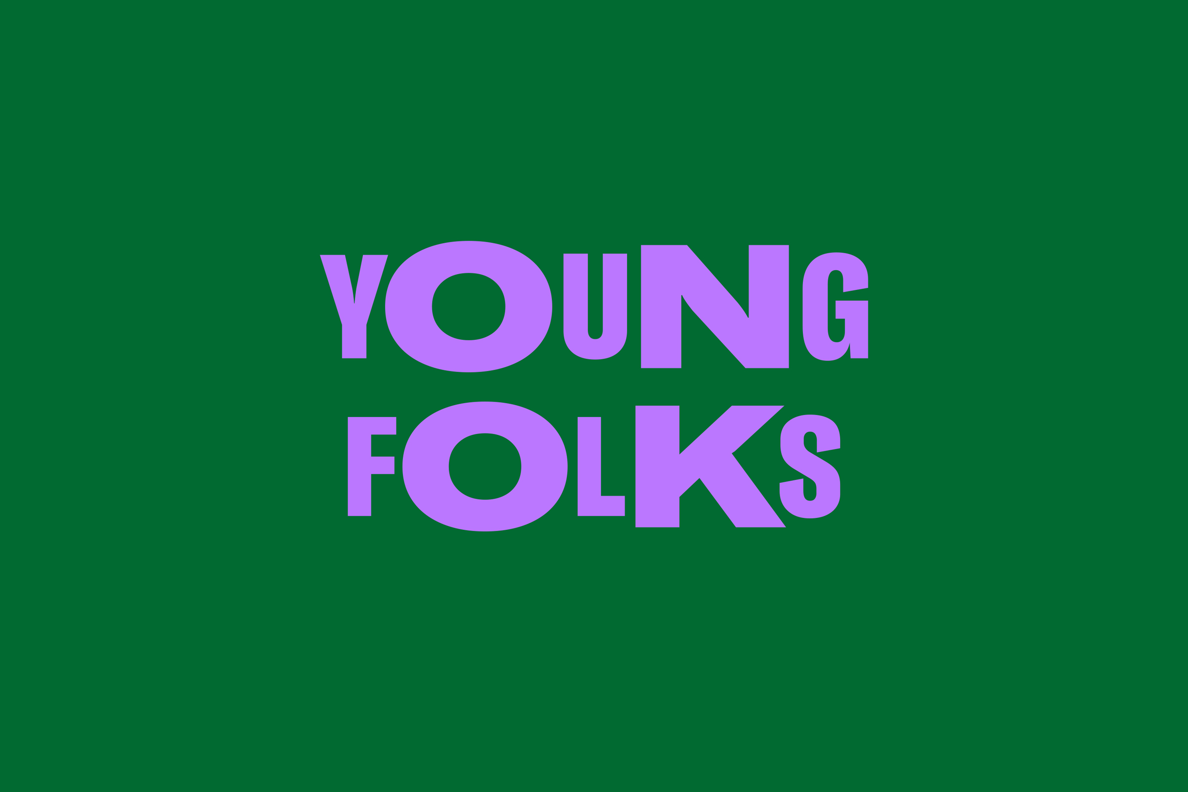
Young Folks is a youth organization in Latvia which consists of more than twenty sub-organizations created and managed by young people. Its new visual identity helps to create individual recognition, as well as a common visual language for all Young Folks sub-organizations, including any that would be created in the future. The visual identity has a dynamic headline design and a simple applicative illustration design that anyone in an organization can use, derive, and bring to life, regardless of their graphic design skills, age group and access to digital tools. The new visual identity is a system of tools that is used and developed by the young people themselves and that evolves alongside the organization.
Originality and creativity of the idea
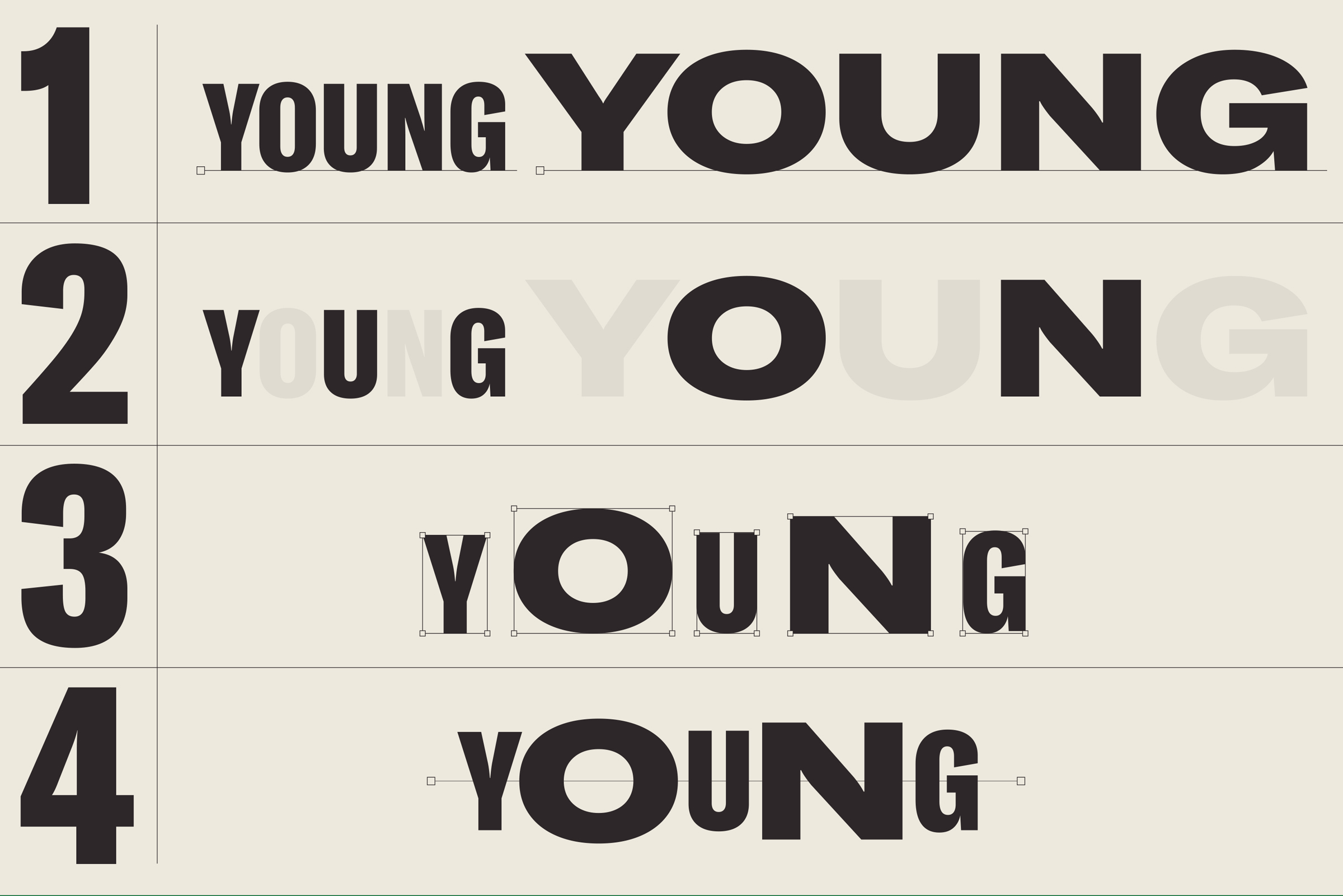
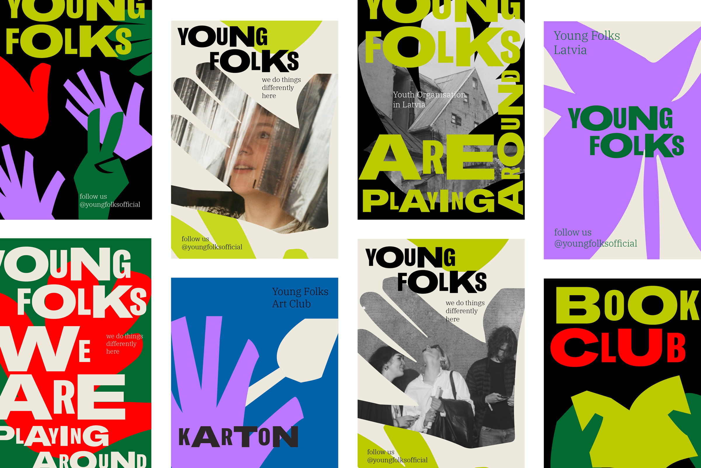
The visual identity allows young people to create their own individual derived visual identities for each of the Young Folks sub-organizations, while maintaining a visual belonging to the Young Folks community. Taking into account the specifics of the organization and the self-organization of young people, the visual identity is brave, suitable for self-expression for a young audience, and simple, so that it could be adapted, used and improved upon by any volunteer. The simple visual principles – dynamic lettering and applicative illustration – work in a wide variety of colour combinations, therefore allowing each sub-organization to stand out with its own, unique colour palette.
Definition of the problem and the relevance of the applied solutions
The purpose of the visual identity was to create recognition and unity, and to transfer these visual tools and the principles of their use in communication to the many sub-organizations of Young Folks. Young Folks is a non-profit organization with a large number of volunteers and extensive graphic design needs. During the development of the visual identity, the goal was to create a set of tools and a professional visual language that could be used and improved upon by the members of the organizations, taking into account the digital tools, human resources and practical skills available to them. The visual identity was created in a way that allowed for the formation of new sub-organizations which could use these tools for their purposes. The unique visual language communicates energy, courage and self-organization and has already been brought to life in many sub-initiatives within the organization by the young people themselves (see attached picture).
Co-creation, stakeholder involvement and cooperation during the realisation process
The visual identity was created in consultation with the management of the Young Folks organization, by researching the resources available in the organization and the opportunities to continue creating communication materials by themselves. It was established that many young people in the organization are interested in creating graphic design, but they lack the professional skills. In addition, we identified the digital tools and skills available in the organization which could be used in the creation of communication materials. We held a masterclass during the creation of the visual identity where many of the young people involved acquired the skills of illustration and graphic design necessary to use the new visual identity. As a result of the masterclass, the youth created a Young Folks sub-initiative illustration bank.
Functionality and technological solutions
The technological solution and functionality of the Young Folks visual identity is designed based on the specifics, skills, and limitations of the organization. The goal was to create a visual identity that the young people would be interested in and improve upon themselves.
Aesthetics and other experiential dimensions
The aesthetics of the visual identity is inspired by the courage, self-organization and relentless energy of young people. The unique dynamic typeface communicates this energy, making the communication materials speak in a lively and attention-grabbing way. The illustrations which also serve as accompanying elements of the sub-organizations' logos, are created by the young people themselves so they display the identity of the young people and the nature of the organizations in a very direct way.
Economic significance, sustainability and circularity
The non-governmental sector and community self-organization initiatives make a significant contribution to the overall well-being of society. In self-organized, non-profit communities, the services of professional graphic designers are limited. Youth self-organization initiatives develop a sense of community, enable the acquisition of a wide range of skills and help create responsible and compassionate future generations. A visual identity that is widely usable and adaptable without the need for an independent graphic designer, helps self-organized communities develop and contributes to their viability. The visual identity was created in a way that it is accessible to any participant. This raises interest in design and provides the users with the opportunity to create designs themselves, thereby facilitating creativity.
Social relevance, inclusion, availability and accessibility
The Young Folks visual identity is designed to promote the inclusion of young people and to provide them with access to graphic design tools, regardless of age and previous experience. The masterclass we held was attended by children from the age of ten, and it gave young people the necessary skills to further design and improve their visual identity. In the masterclass, young people acquired the knowledge necessary to express their creativity with the use of graphic design tools and to create communication materials that accurately convey the nature, uniqueness, and ideas of youth-initiated organizations.